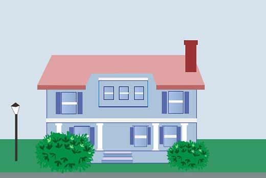
Blue House with Illustrated Bushes

Today I worked on some bushes. Not bushes outside my house (although those can certainly use trimming). No, I added two illustrated bushes to the front of the blue illustrated house I started last week.
Next step will probably be working on clouds. My plan is to add text to the inside of the clouds, so the illustration will “talk to you.”
I only found one tutorial on how to make the illustrated bushes. Maybe I will write my own? Unfortunately, I found the technique I used rather cumbersome, so I can’t say I would recommend it. So, no, probably no post on how to create illustrated bushes. But I would happy to read one written by someone else.

Lorri M. says
I like this, Leora. The bushes and grass give the house a lived in look, from the exterior. I like the shutters, nice addition (contrasting with the blue windows), and love the lamppost (so charming and classic looking).
Leora says
This is beginning to feel like a year-long project, but there it is. Hopefully, I will feel pleased in the end. I already put an initial banner with three houses on a new mockup of a home page ... might ask you to give me feedback when I'm ready to put it online in a test area.
Thanks for the support, Lorri.
Lorri M. says
I'll be glad to give feedback, anytime. :)
Laura says
I love the bushes--they give texture and depth to the illustration. I like the lamppost, too, but I am confused a little by it. Is it lighting for the house or a street lamp?
Leora says
Interesting point. This what happens when you cobble together different elements. If you walk down North Fifth near the library, Laura, you may see the house with a lamppost. That's what inspired this one. I kind of moved it in between two houses... not sure if I really need to explain much in a mural, just show elements of a suburban community with older houses.
Ramblingwoods says
I am following your progress.... I like it so far!
Please leave a comment! I love to hear from you.